“I don’t like pie charts and if it is 3D pie chart then I will kill you.”
People are using pie charts from last two centuries and if you will tell them pie charts are bad then you can see the sense of confusion on their face. Some will laugh at you.
But here are some of the reasons to support my argument.
1.Color means nothing?
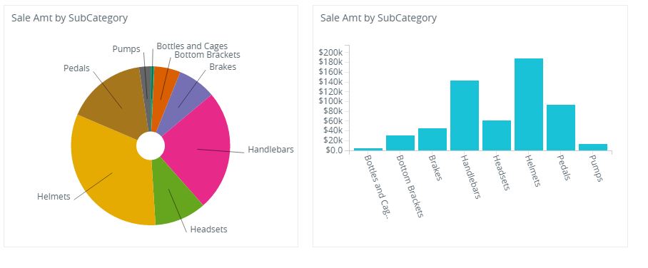
In the example above can anyone tell me what is the meaning of the color? Is that just for differentiation of the pie from each other ?
2. Pies tell nothing if the numbers fall near to each other?
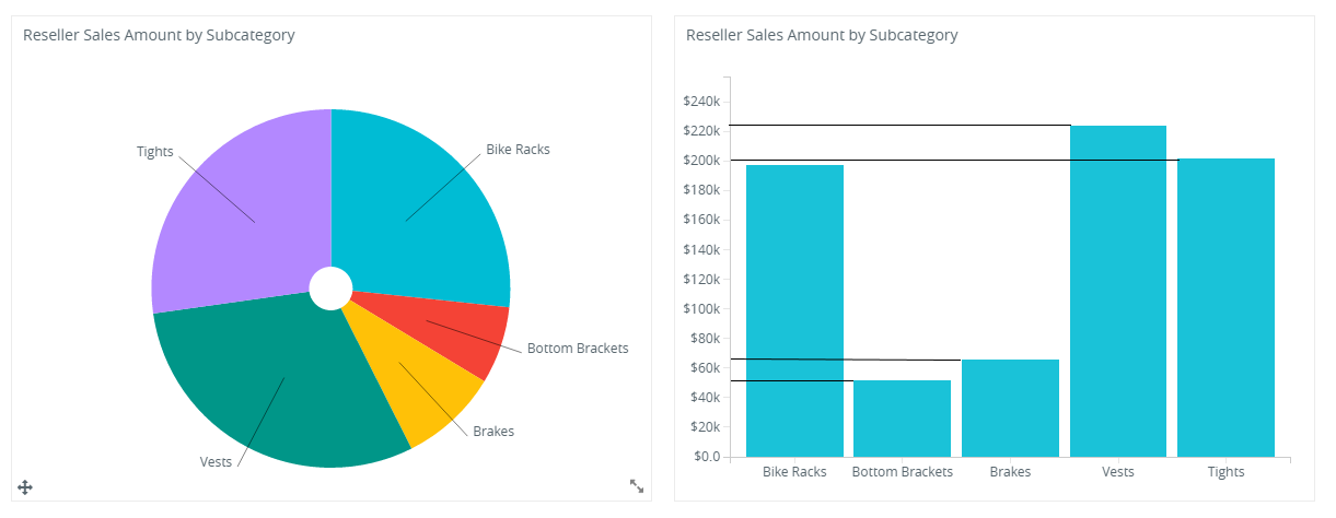
Let’s pie chart in the example above is showing the sales amount. Can anyone answer the following question :
- Which category has the highest sale?
- Are “Brakes” and “Bottom Brackets” are equal?
- What is the difference between “Vests” and “Tights“?
Unless you have bar chart in the right side. I think its very hard to answer all above question.
3. 3D Pie Chart : best way to mislead.
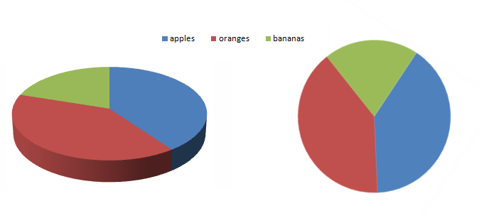
If a normal eye look at the 3D pie chart on the left. It would get an impression that oranges (in maroon color) had the most of the share where as if we look the same chart in 2D we will get to know that both oranges and Apples have same share.