User Experience – Mobile first designs

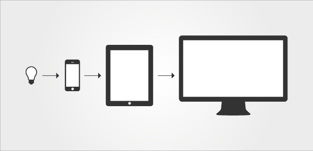
What is mobile first designs?

Mobile first is the strategy or approach of making web pages (application) works with best usability, perfect functionality and visually attractive on mobile (small screens) as a first step.

mobile-first-ux


What is difference between mobile and desktop when designing user experience?

  Desktop Mobile
Space More Space Less Space
Internet connection Trouble free, more stable Less stable, more trouble
Time User have time User is always in hurry
Screen Fixed Flipping
Call to action buttons Vary in size Big enough to be touched with thumb or finger


Tips for Mobile first design

  1. Forget the existing desktop environment.

If you are starting with a new project, forget everything about desktop. Only think of the small screen, less resources, less space and most important content.
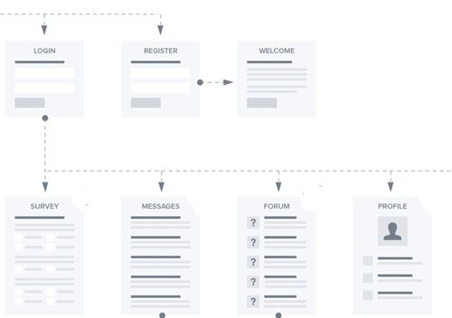
2. Draw user flow

Identify the key steps of the application and draw the user flow out of it.

mobile-ux-user-flow


3. Identify the key content

Mobile first is also understanding of the key content of the application. Limitation of the size and need of bigger font size forces you to choose the most important content.

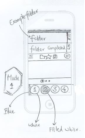
4. Draw your ideas on paper

Experiment your ideas by drawing it on paper. Drawing on paper is the best way to find the right solution soon.

Mobile-ux-hand-design-example

5. Use meaningful icons

Icons are most important thing in the mobile design. Choose your icons wisely and be consistent though out your application. Make sure you are using the standard icons like remove as bin icon, cancel as close icon.

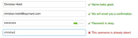
6. Provide notification (feedback)

Always provide user with the feedback if something is going wrong. Lets say internet connection is lost. Let the user aware of it. Providing user constant feedback not only prevent their time but they will also trust you more.

UX – Working with forms – Basics

Never ask for more than 5 inputs in one go. 

Asking more than 5 inputs from user in one go is killing.

Example 1:

Here is an example of the worst user experience with forms.  worstform

What is wrong with above form?:

  • Too many input fields
  • Too busy and no layout.
  • No guidance where to start

Now these types of form should be done in way shown below

goodform


Single column based forms are better. 

Using more then one column require more eye movement and user has to spent more time to fill up the form.

UX – Working with forms – Validations

Inline form validation is best. 

Days are gone passed when on click of submit button user were shown errors in the form. Inline validation is best way to show what is going wrong with the field and how to over come that. By doing this you are saving the time of the user.

Example 1:

Below is the example of the inline form validation.

validation

UX – Working with forms – Getting inputs

Always guide the user when getting input. 

When your are trying to get information form the user make sure you let user what kind of information you want. For example input field should have label and masked with example input.

Example 1:

Instead of giving free text field its better to give the masked text fields so that user know where to fill what. Below is the examples of the 3 different ways of doing the same thing.

dateofbirth.

Now the next question is which one is best among them. I will explain this another post.

Golden rules of User Experience 2

Always notify user. 

When user performs an action always make sure he is getting the enough information what is is going on.

Example 1:

User should always aware of what is going on. Modern front end technologies use MVC frameworks which always fail to notify user.

notofication

Example 2:

Always show progress bar or loading status if we want user to wait for something.

connecting

Show user their footprints.

Showing breadcrumbs is always a better idea

  • If your website has lot of pages including nested categories.
  • If user is not on mobile device
  • If user is working with forms and there are lot of steps in filling the form.
  • If you have e-commerce website

That way user will never get lost.