Now that I got to know how the custom visuals can be developed in Qlik sense. Here is something that is more useful. Inspired from the hierarchy tree of d3, driver tree has lot more features. Below is the list of some of those.
Features:
Visualize hierarchies
Multiple measures can be seen.
Collapse and expand the different levels of hierarchy.
Over the past 1 year I have been developing lot of charts with d3.js. and I thought of taking it to next level.
So just for fun I was exploring the Qlik sense developer environment and got to know that developing custom visualization in Qlik sense is not that hard.
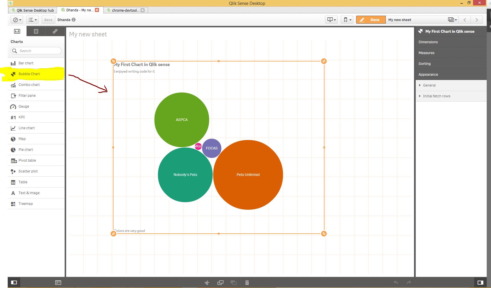
I started with downloading the desktop version of Qlik sense and started following a simple tutorial.
In just 3 hours, I manage to develop the BUBBLE CHART in Qlik sense. Please see the image below.
From last 2 weeks I am trying to find out the best ways for story telling with data. I am already using d3.js and can create pretty animation with that but that is not good enough.
I was looking for the some thing that is more impressive and interactive. Then i found free java script library impress.js. We can do some cool stuff with it.
National Center for Statistics and Analysis of United states brought up the facts from their data about the fatalities of pedestrians in United states. Based on the data published on this report on their website, I have created a story that is far more interactive and easy to understand their report.
After the first month of launch of Microsoft Power BI, Microsoft announced the best data visualization competition. One has to develop a creative custom data visual in PowerBI. I think the aim was to get some interest from the users and give developers the chance to show their creativity.
I got to know about the competition two weeks later from starting date and and I was left with only 2 weeks for my submission.
Now, the challenge was to understand their underline architecture and work out how they were integrating d3.js with the rest of the system.
Microsoft made this project open source which mean source code is available on github. The benefit of that is one can make out how the code is working.
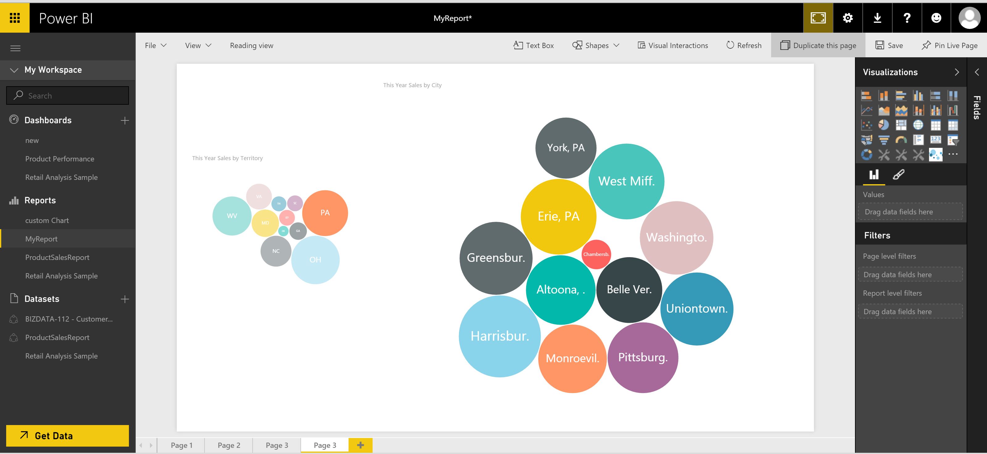
Finally I decided to put my step inside the door and start with very simple bubble chart.
See example below.
Because Microsoft has provided the playground environment inside the project it wasn’t that difficult and on top of it it has provided the web based development environment where one can run and test his code directly.
Within a week I manage to create bubble visual which was working in Power BI way. I got to know, how the following things are working:
Properties
Cross Filtering
Transitions
Check the screen shot of the custom visual.
As a part of submission of entry for competition I was supposed to make a video of the working custom visual. Check You tube video of working custom visual.