Skip to content

Dharminder dhanda

  • Charts
  • User Experience
  • Microsoft Power BI
  • d3.js
  • Data Visualization

Charts

Nightingale chart

Posted by admin on April 29, 2016 in Charts0 Comment

Nightingale

Radar chart

Posted by admin on April 29, 2016 in Charts0 Comment

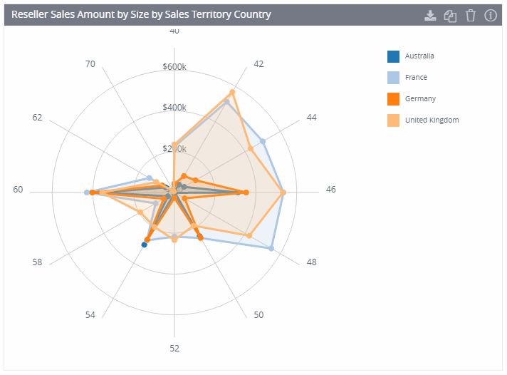
The radar chart plots category values relative to a center point.

Radar

Properties of Radar Chart

  1. Color Scheme

Radar-Color-Scheme


2. Fill Area

Radar-FillArea


Sankey chart

Posted by admin on April 29, 2016 in Charts0 Comment

Sankey

Slope chart

Posted by admin on April 29, 2016 in Charts0 Comment

Slope

Sun burst

Posted by admin on April 29, 2016 in Charts0 Comment

SunBurst

Posts navigation

← Previous 1 2 3 … 7 Next →

Recent Posts

  • Sparkline/Bar-Line/Area custom visual for powerBI
  • Card/ Status card/ Icon card custom visual for powerBI
  • KPI card for powerBI
  • Heatmap/ Barcode chart for powerBI
  • Multiple Sparkline for powerBI

Categories

  • Charts
  • d3.js
  • Data Visualization
  • Microsoft Power BI
  • Qlik Sense
  • Story Telling
  • User Experience
  • worst dataviz

Tags

Videos
© 2025 Dharminder dhanda