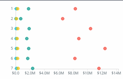
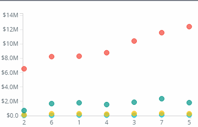
Scatter Plot charts are useful for showing a correlation (or not) between two measures.

Properties of Scatter Plot
- Change color scheme

2. Legend Position

3. Statistics (Regression, Mean, Median)

4. Highlight Sections

Scatter Plot charts are useful for showing a correlation (or not) between two measures.
2. Legend Position
3. Statistics (Regression, Mean, Median)
4. Highlight Sections
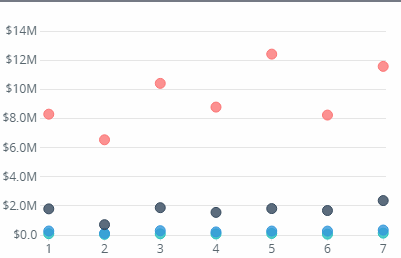
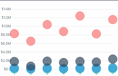
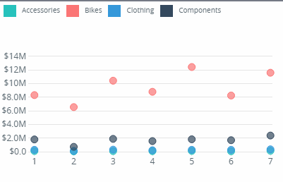
Dot Plots are useful for showing discreet values. They also have the option of showing a secondary measure as bubble size.

2. Chart Orientation (Horizontal, Vertical)
3. Sorting
4. Statistics (Mean, Median, Mode, Regression)
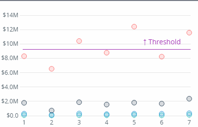
5. Threshold
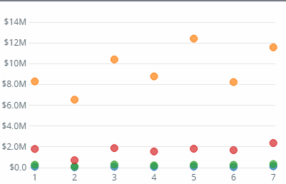
6. Dot Size
7. Legend Position
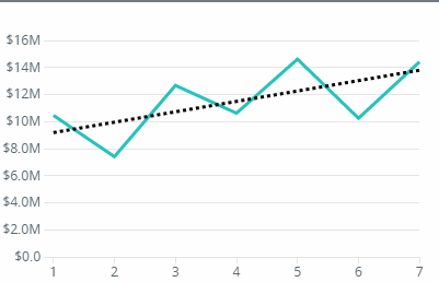
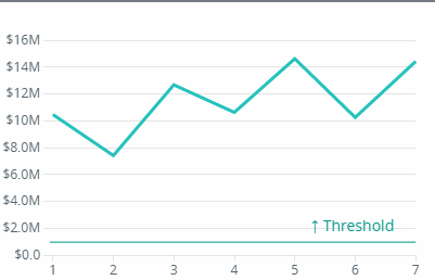
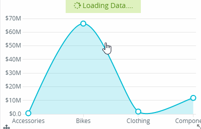
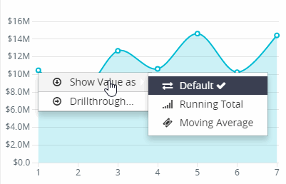
Line charts are useful for displaying data over time. Includes options on the type of line – curved, linear, stepped.

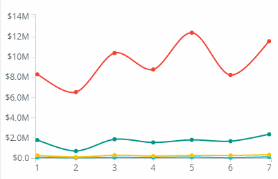
2. End and Start Bubble
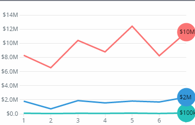
3. Change color scheme
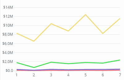
4. Curve Type
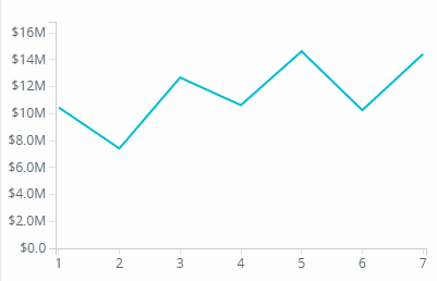
5. Legend Position and Type
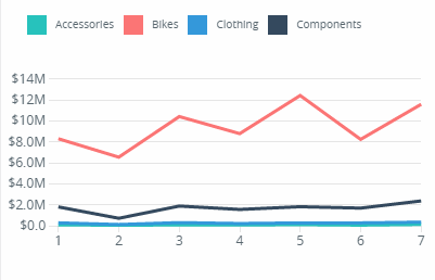
6. Statistics (Mean, Regression, Median, Mode)
7. Threshold Line
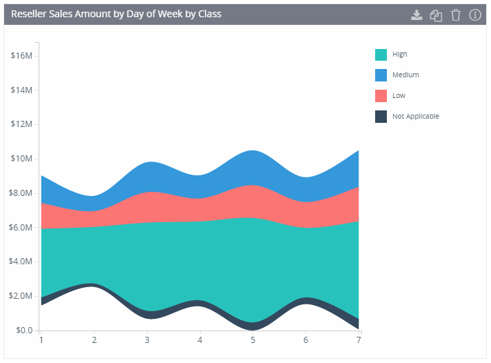
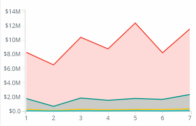
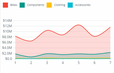
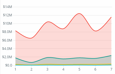
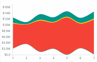
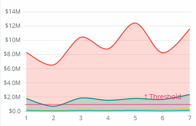
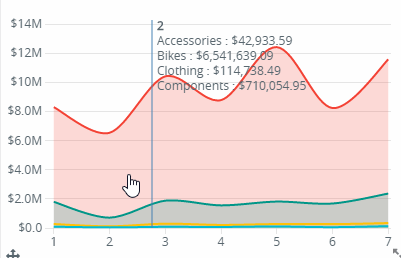
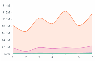
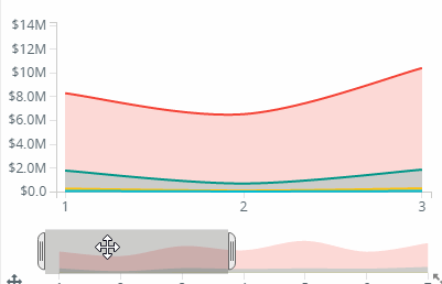
Area charts are useful for displaying data over time.
Multiple measures can be included in the Values field. These will be displayed in a drop down box on the top right hand corner of the chart.
2. Legend Position (Top, bottom, right)
3.Axis Labels (show/hide)
4. Area Type (horizon, stack, stream)
5. Line Stroke, Tooltip circles
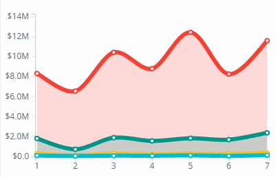
5. Threshold line
6. Drill up and drill down data
7. Analytic
8. Bisector tool tip
10. Changing color
11. Context bar
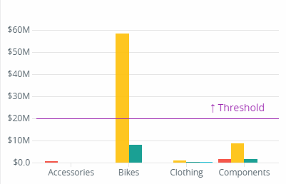
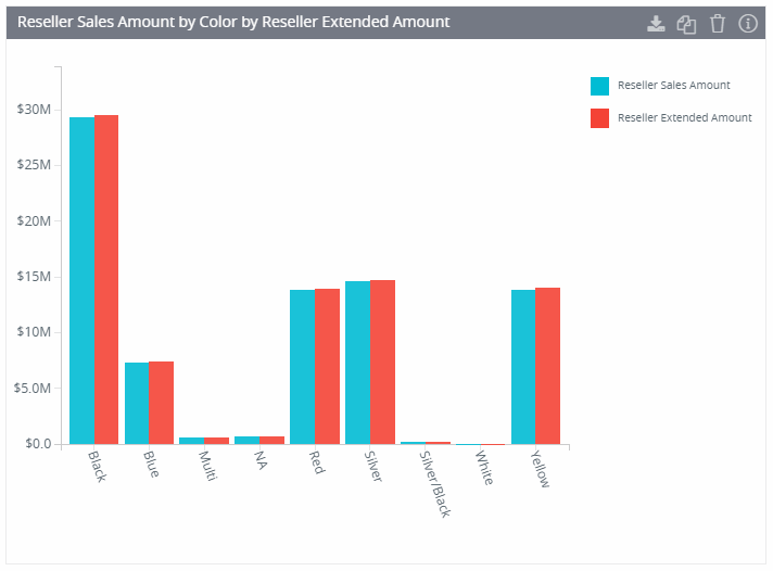
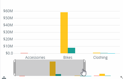
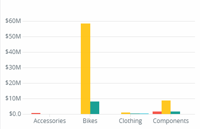
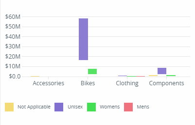
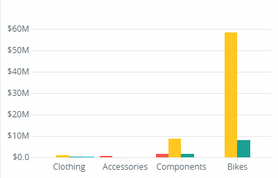
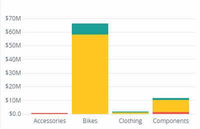
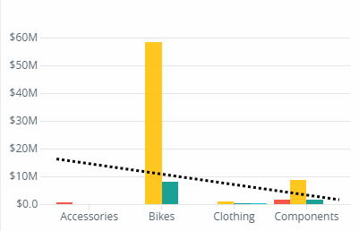
Bar charts are very good for displaying a series of discrete values. It is very useful for comparisons among categories.

2. Context Bar
3. Labels
4. Legend Postion
5. Sorting
6. Stack Type (Group, Stacked, Stacked 100%)
7. Statistics Lines (Regresison, Mean, Mode, Median )
8. Threshold Value