Web site should feel fast: UX Principles #4

Speed is the second most thing which counts to the best user experience. Most of the user don’t have time and if your website is not responsive enough then they will leave immediately.

Follow some of the tricks to pretend that your website is fast:

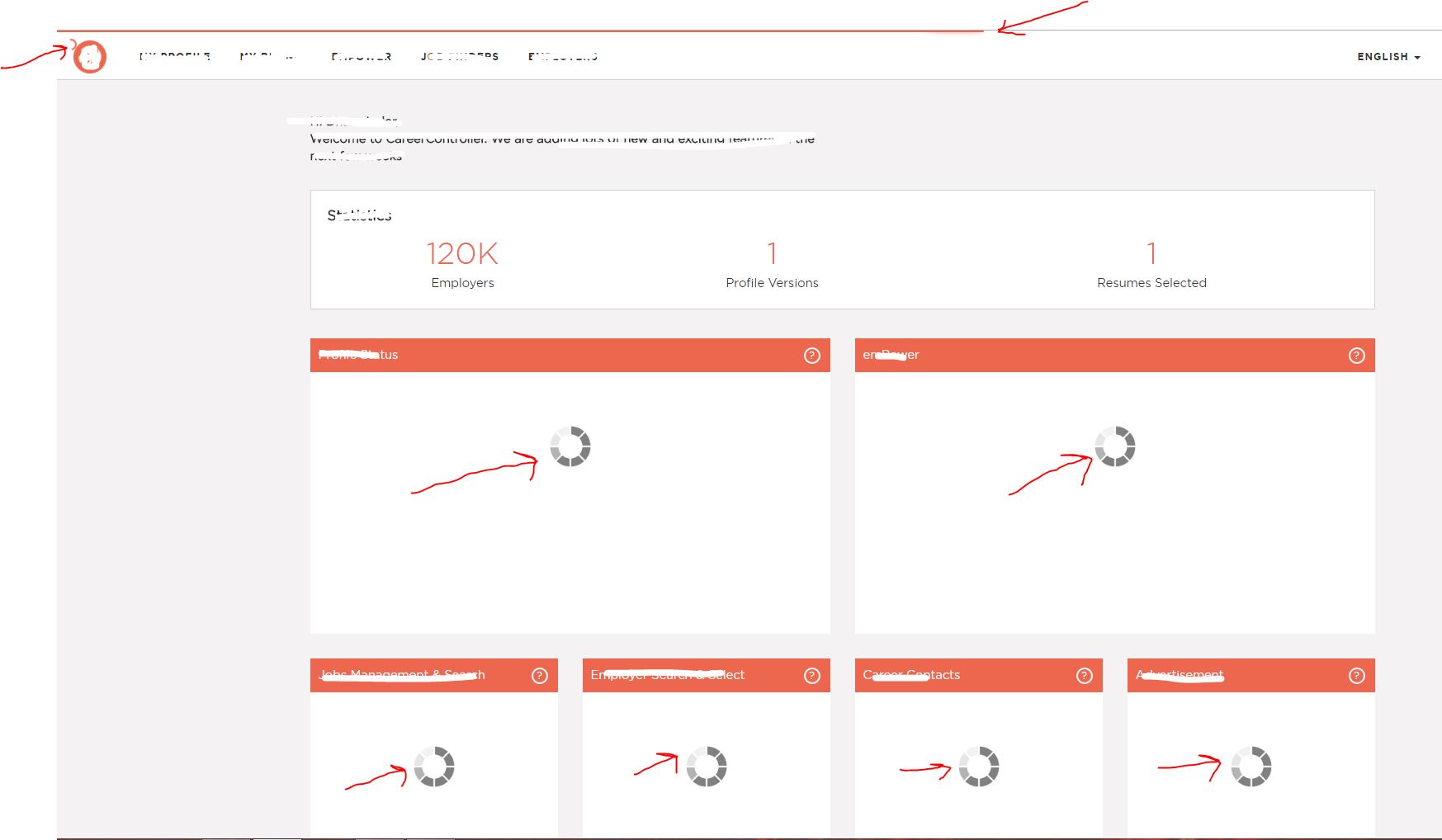
  1. Don’t load all the components at same time. Only load the one that are most important. Don’t show too many loading icons. TooMuchLoading
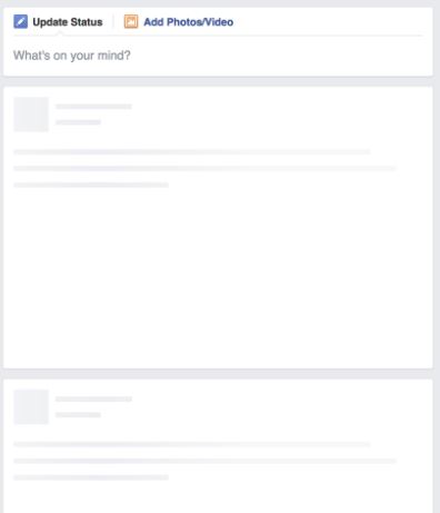
  2. Show a skeleton of the website’s elements to communicate the layout when it is loading.loadingSkelton


Give breathing space (white space) : UX Principles #2

What is breathing space or white space ?

It is space between elements in composition. The core concept is to distinguish the elements and the sections of the page. Elements of white space are:

  • Images, graphics and logos
  • Padding, gutters and margins
  • Line and letter spacing between the text and lines
  • Space between the columns

Below is the example of use of white space

breathing space

Benefits of using white space

Improves readability

Key aspect of the user experience is the high readability of the content. Line spacing and letter spacing have great impact on the readability.


User will focus on what is more important

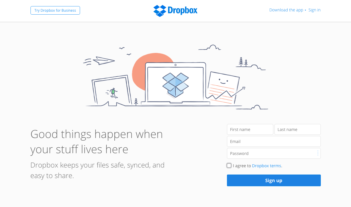
More you provide space int the elements more focused it will be. Prime example is drop box.
dropbox

In the example above the user will find what they want in a second without any trouble because all elements are clean enough.
 

Less is more: UX Principles #1

less is more

Simple is always best. But keeping things simple is very hard. It comes with hidden complexity. The process is called minimalism.

Minimalism

It is the act of stripping the page or form to its very basic and necessary elements that will help to give message more clear and loud. It does not mean removing the necessary navigation, buttons and icons.

Ask yourself following question after doing 1st draft of the your experience.

  • What can you take off from the experience which will make it more clear to user and help to take them better decisions?
  • What options or settings can be shown or asked when user is more loyal and engaged?
  • Are you giving user more than what they ask for?
  • Can you take off the multiple colors?
  • Are there controls or forms that can be collapsed?
  • Can we use icons instead of text?

After answering all the above questions do one more iteration. Doing this exercise will help you to achieve the best experience.