After the first month of launch of Microsoft Power BI, Microsoft announced the best data visualization competition. One has to develop a creative custom data visual in PowerBI. I think the aim was to get some interest from the users and give developers the chance to show their creativity.
I got to know about the competition two weeks later from starting date and and I was left with only 2 weeks for my submission.
Now, the challenge was to understand their underline architecture and work out how they were integrating d3.js with the rest of the system.
Microsoft made this project open source which mean source code is available on github. The benefit of that is one can make out how the code is working.
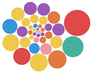
Finally I decided to put my step inside the door and start with very simple bubble chart.
See example below.
Because Microsoft has provided the playground environment inside the project it wasn’t that difficult and on top of it it has provided the web based development environment where one can run and test his code directly.
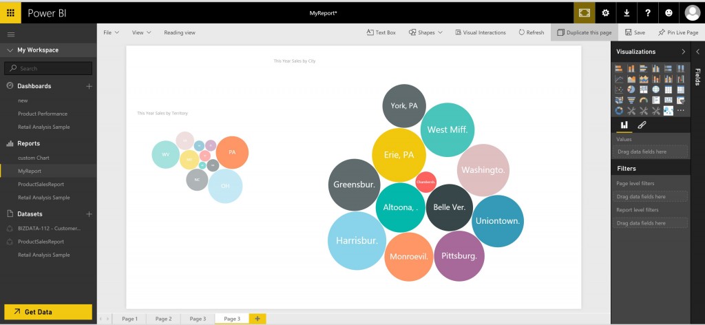
Within a week I manage to create bubble visual which was working in Power BI way. I got to know, how the following things are working:
- Properties
- Cross Filtering
- Transitions
Check the screen shot of the custom visual.
As a part of submission of entry for competition I was supposed to make a video of the working custom visual. Check You tube video of working custom visual.
Get Bubble Chart visual from here : https://app.powerbi.com/visuals/

