UX – Working with forms – Basics

Never ask for more than 5 inputs in one go. 

Asking more than 5 inputs from user in one go is killing.

Example 1:

Here is an example of the worst user experience with forms.  worstform
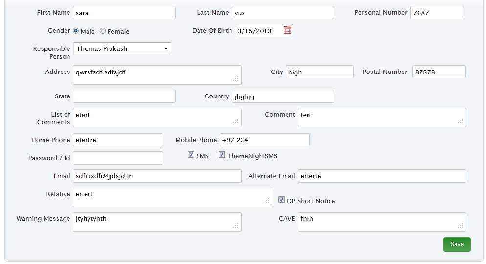
What is wrong with above form?:

  • Too many input fields
  • Too busy and no layout.
  • No guidance where to start

Now these types of form should be done in way shown below

goodform


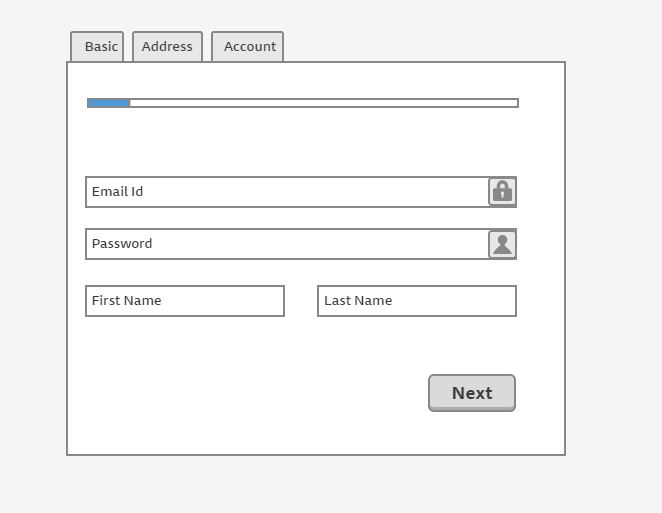
Single column based forms are better. 

Using more then one column require more eye movement and user has to spent more time to fill up the form.
UX – Working with forms – Validations

Inline form validation is best. 

Days are gone passed when on click of submit button user were shown errors in the form. Inline validation is best way to show what is going wrong with the field and how to over come that. By doing this you are saving the time of the user.

Example 1:

Below is the example of the inline form validation.

validation

UX – Working with forms – Getting inputs

Always guide the user when getting input. 

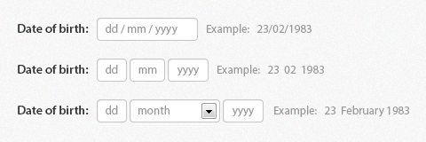
When your are trying to get information form the user make sure you let user what kind of information you want. For example input field should have label and masked with example input.

Example 1:

Instead of giving free text field its better to give the masked text fields so that user know where to fill what. Below is the examples of the 3 different ways of doing the same thing.

dateofbirth.

Now the next question is which one is best among them. I will explain this another post.

Golden rules of User Experience 2

Always notify user. 

When user performs an action always make sure he is getting the enough information what is is going on.

Example 1:

User should always aware of what is going on. Modern front end technologies use MVC frameworks which always fail to notify user.

notofication

Example 2:

Always show progress bar or loading status if we want user to wait for something.

connecting

Show user their footprints.

Showing breadcrumbs is always a better idea

  • If your website has lot of pages including nested categories.
  • If user is not on mobile device
  • If user is working with forms and there are lot of steps in filling the form.
  • If you have e-commerce website

That way user will never get lost.

Golden rules of User Experience 1

Don’t teach user a new thing.

If you making your first application don’t ever take the risk of teaching user new thing. Like new type of control, navigation or buttons. Once user are loyal to your application only then they will accept new things.

Example 1:

UX2

In the example above the form seems very impressive but 90% of the user will not click on the text for options. Either you have to teach them or use the old fashion form to make it work.

Example 2:

UX1

Above example have the next button inside the input control and most of the user will take this an icon. So putting a next button is much better option rather than be creative.

Always engage with user.

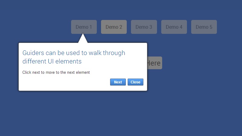
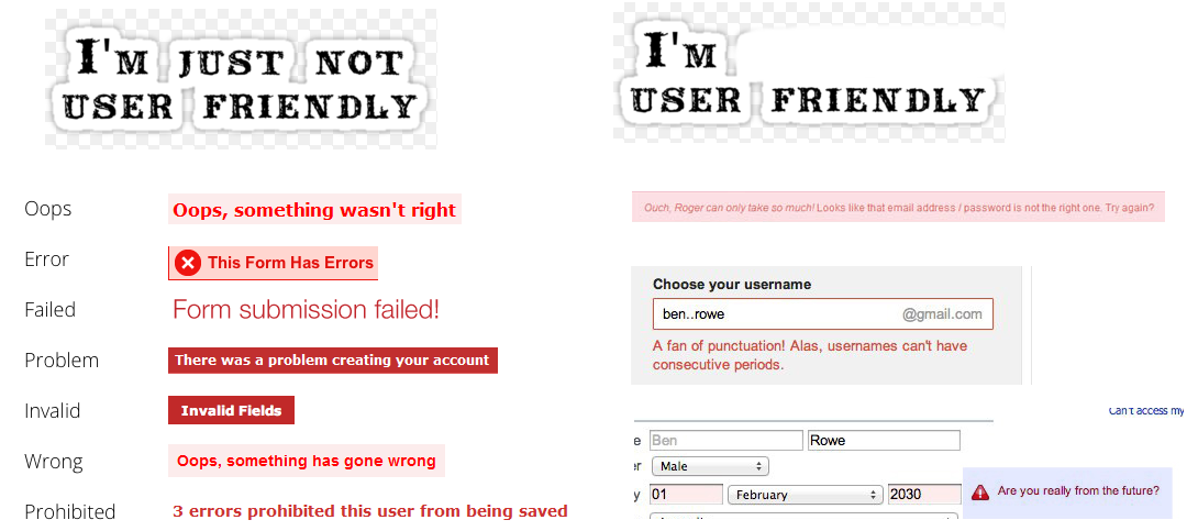
Communication with user should be very engaging. Always guide user by notifications, help section, friendly error messages and first time website tours.

Example 1

tourguide

if the user is coming to your website first time, take him to the tour of the website.

Example 2

ErrorMessages-GoodVsBad